library(tidyverse)
library(palmerpenguins)AE-01 Meet the Penguins
Application exercise
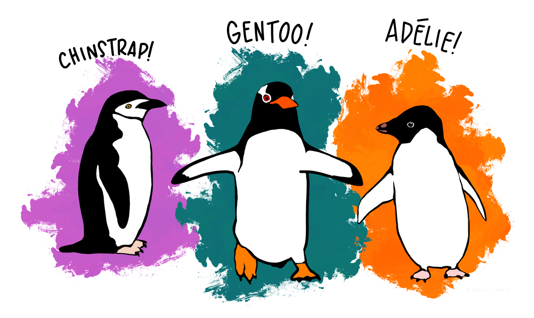
In this activity, we will meet some penguins, start thinking about data and variables, and see some R code in action. The penguins data from the palmerpenguins R package contains size measurements for three species of penguins observed on three islands in the Palmer Archipelago in Antarctica.
Data were collected and made available by Dr. Kristen Gorman and the Palmer Station, Antarctica LTER, a member of the Long Term Ecological Research Network.
In order to access this data, we need to load the package into R. While we’re at it, we can load any other packages that we need.
A First Look at the Data
Let’s take a peek at the data with the following R code:
head(penguins)# A tibble: 6 × 8
species island bill_length_mm bill_depth_mm flipper_length_mm body_mass_g
<fct> <fct> <dbl> <dbl> <int> <int>
1 Adelie Torgersen 39.1 18.7 181 3750
2 Adelie Torgersen 39.5 17.4 186 3800
3 Adelie Torgersen 40.3 18 195 3250
4 Adelie Torgersen NA NA NA NA
5 Adelie Torgersen 36.7 19.3 193 3450
6 Adelie Torgersen 39.3 20.6 190 3650
# ℹ 2 more variables: sex <fct>, year <int>This command gives us a table (tibble) which shows us the first six rows of the data frame called penguins. When working with data, we typically want each row to be an individual observation (or case), each column to be a variable, and each entry (cell) to be a single value. Data that is in this format is called tidy. A significant part of the work involved in analyzing data is getting it tidy (a process often referred to as “cleaning the data”) or at least accounting for ways in which it isn’t tidy.
Other points of view
Here are two other R commands we can use to view the data.
print(penguins)# A tibble: 344 × 8
species island bill_length_mm bill_depth_mm flipper_length_mm body_mass_g
<fct> <fct> <dbl> <dbl> <int> <int>
1 Adelie Torgersen 39.1 18.7 181 3750
2 Adelie Torgersen 39.5 17.4 186 3800
3 Adelie Torgersen 40.3 18 195 3250
4 Adelie Torgersen NA NA NA NA
5 Adelie Torgersen 36.7 19.3 193 3450
6 Adelie Torgersen 39.3 20.6 190 3650
7 Adelie Torgersen 38.9 17.8 181 3625
8 Adelie Torgersen 39.2 19.6 195 4675
9 Adelie Torgersen 34.1 18.1 193 3475
10 Adelie Torgersen 42 20.2 190 4250
# ℹ 334 more rows
# ℹ 2 more variables: sex <fct>, year <int>glimpse(penguins)Rows: 344
Columns: 8
$ species <fct> Adelie, Adelie, Adelie, Adelie, Adelie, Adelie, Adel…
$ island <fct> Torgersen, Torgersen, Torgersen, Torgersen, Torgerse…
$ bill_length_mm <dbl> 39.1, 39.5, 40.3, NA, 36.7, 39.3, 38.9, 39.2, 34.1, …
$ bill_depth_mm <dbl> 18.7, 17.4, 18.0, NA, 19.3, 20.6, 17.8, 19.6, 18.1, …
$ flipper_length_mm <int> 181, 186, 195, NA, 193, 190, 181, 195, 193, 190, 186…
$ body_mass_g <int> 3750, 3800, 3250, NA, 3450, 3650, 3625, 4675, 3475, …
$ sex <fct> male, female, female, NA, female, male, female, male…
$ year <int> 2007, 2007, 2007, 2007, 2007, 2007, 2007, 2007, 2007…Summary Statistics
A summary statistic is a single number that summarizes our data in some meaningful way. For example, we might ask:
- What percentage of our Adelie penguins were found on Torgersen island?
- What is the average (mean) flipper length of our penguins?
We can use R to help us analyze the data to answer these questions. We might start by counting how many penguins of each species there are.
penguins |>
  count(species)
# A tibble: 3 × 2
species n
<fct> <int>
1 Adelie 152
2 Chinstrap 68
3 Gentoo 124We can do something similar to determine how many penguins are on each island.
To answer our question, it seems we need to dig deeper. Here we produce what’s sometimes called a two-way, or contingency table. We’ll see these again in Chapter 5.
table(penguins$species, penguins$island)
            Biscoe Dream Torgersen
  Adelie        44    56        52
  Chinstrap      0    68         0
Gentoo 124 0 0Relationships between Variables
An important tool in understanding and analyzing data is visualization. For example, we can use a scatterplot to help us understand relationships between variables. Let’s look at a scatterpolot that compares body mass and flipper length.
ggplot(data = penguins,
       mapping = aes(x = flipper_length_mm, y = body_mass_g)) +
  geom_point()
Warning: Removed 2 rows containing missing values or values outside the scale range
(`geom_point()`).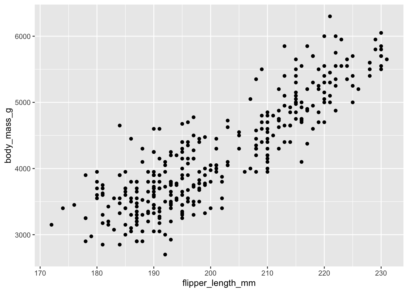
R gives us the ability to modify and customize our visualizations a great deal – indeed this is one of the main strengths of R! Let’s add one more feature to our graph. As we know, there are three different species of penguins in our data set – but our scatter plot does not show this!
ggplot(
  data = penguins,
  mapping = aes(x = flipper_length_mm, y = body_mass_g)) +
  geom_point(mapping = aes(color = species))
Warning: Removed 2 rows containing missing values or values outside the scale range
(`geom_point()`).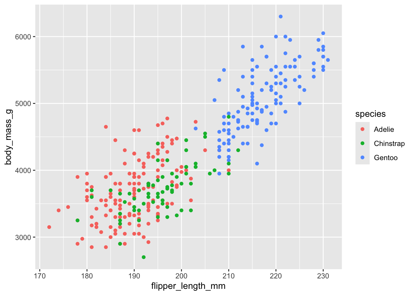
Because people can perceive colors differently due to color blindness or other color vision differences and since different devices might display colors in unexpected ways, it’s good practice to not rely on color alone to distinguish points.