Visualizations: Bar graphs, mosaic graphs, pie charts, waffle charts
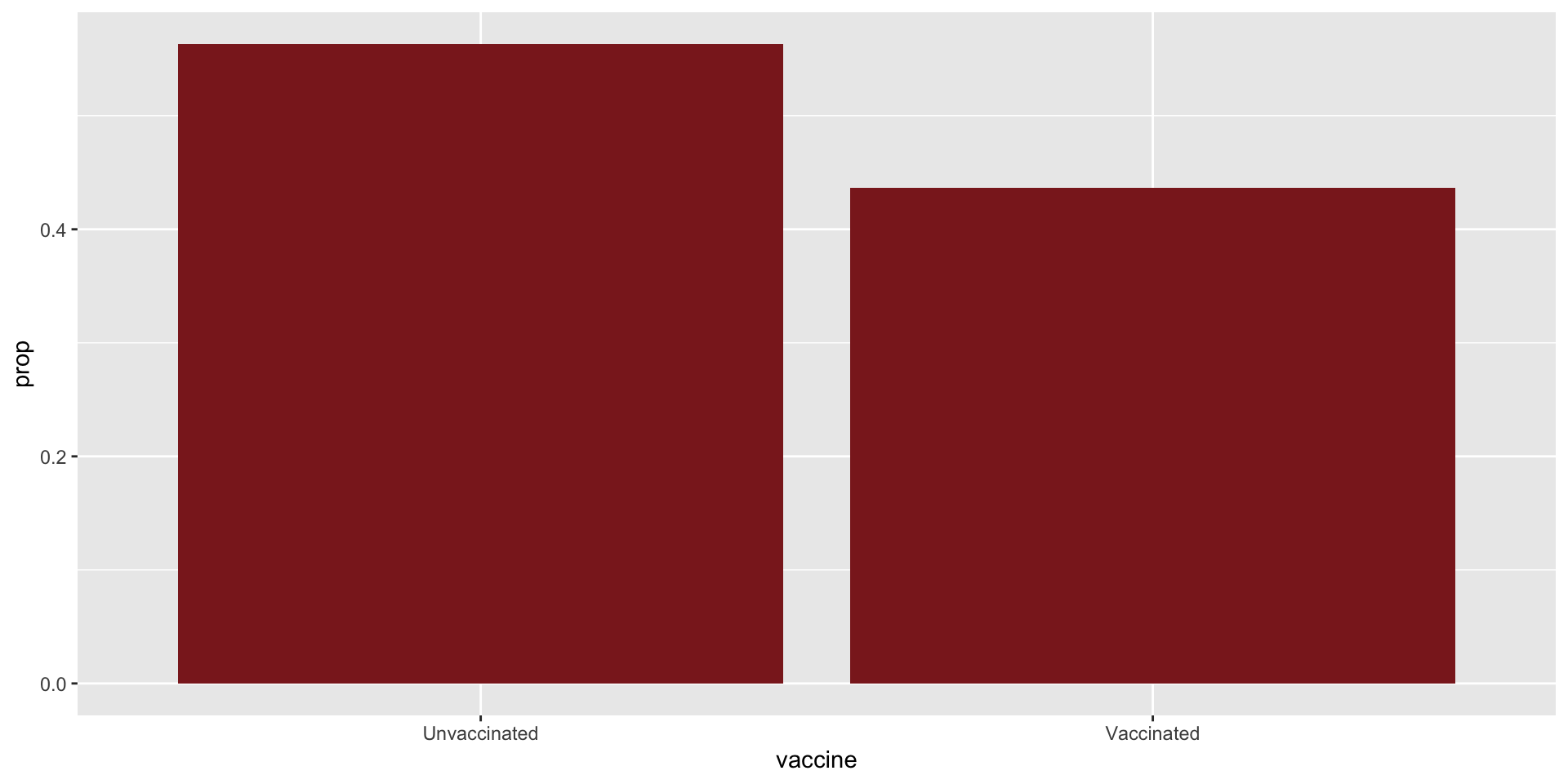
Summary statistics: proportions
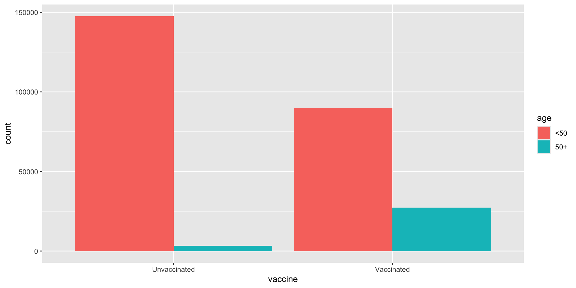
Last week: COVID deaths
library(tidyverse)delta <-read_csv("delta.csv")
print(delta)
# A tibble: 268,166 × 3
   vaccine    age   outcome
   <chr>      <chr> <chr>
 1 Vaccinated <50   died
 2 Vaccinated <50   died
 3 Vaccinated <50   died
 4 Vaccinated <50   died
 5 Vaccinated <50   died
 6 Vaccinated <50   died
 7 Vaccinated <50   died
 8 Vaccinated <50   died
 9 Vaccinated <50   died
10 Vaccinated <50   died
# ℹ 268,156 more rows
summarize two categorical variables
Count
delta |>count(vaccine, outcome)
# A tibble: 4 × 3
vaccine outcome n
<chr> <chr> <int>
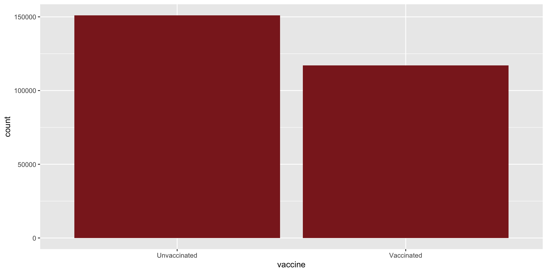
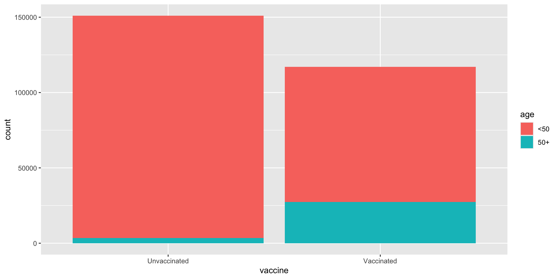
1 Unvaccinated died 250
2 Unvaccinated survived 150802
3 Vaccinated died 477
4 Vaccinated survived 116637
Contingency Table
(also known as two-way table)
table(delta$vaccine, delta$outcome)
                 died survived
  Unvaccinated    250   150802
  Vaccinated      477   116637
Contingency Table with Totals
died
survived
Unvaccinated
250
150802
151052
Vaccinated
447
116637
117084
697
267439
268136
Can easily calculate proportions from this table. E.g. proportion of vaccinated patients that died: \[
\frac{447}{117084} = 0.004
\]
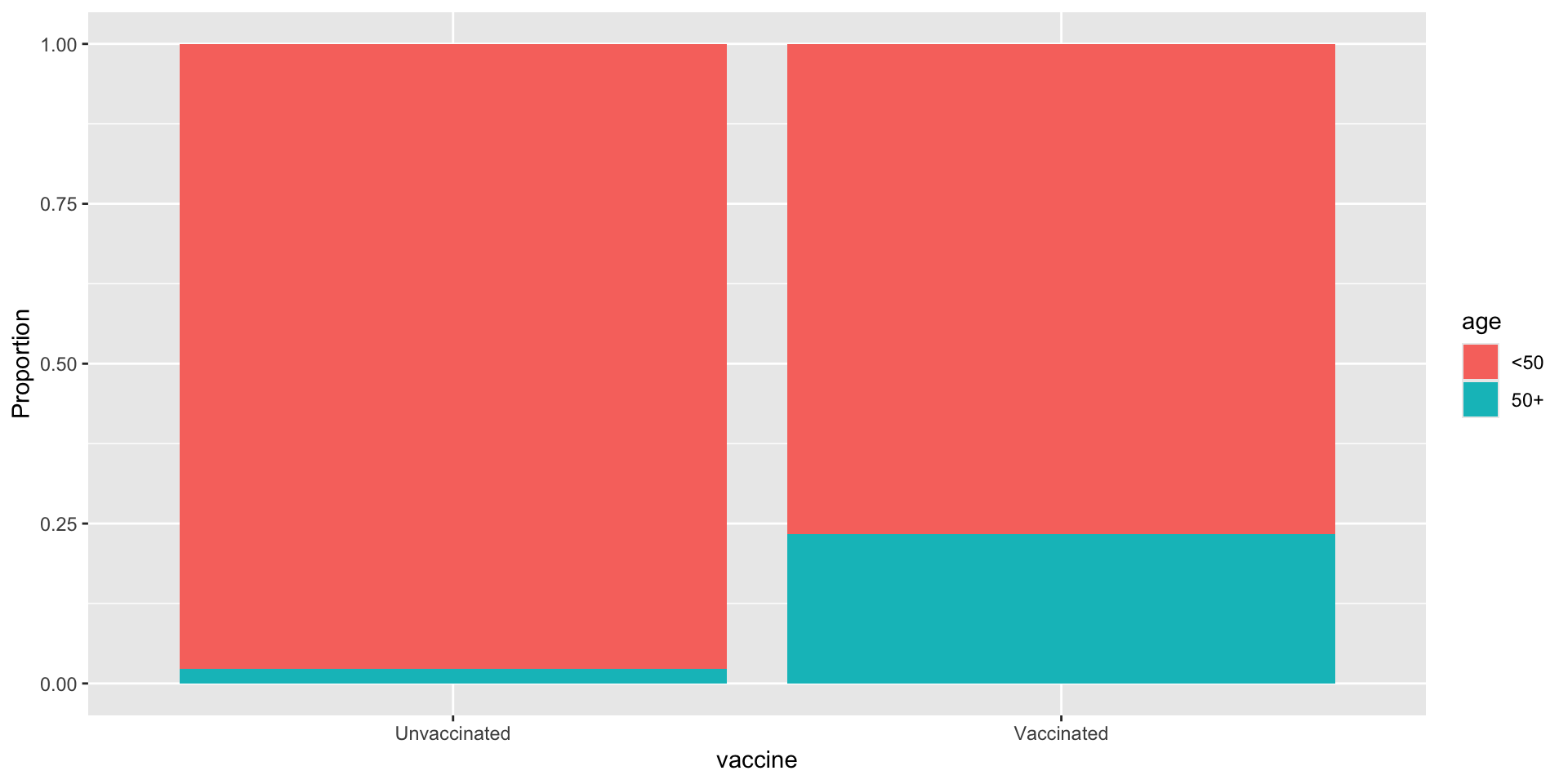
Row and column proportions
Convert each entry to a proportion of either column or row total.
E.g. row proportions gives proportion of all vaccinated/unvaccinate patients that died