Rows: 32,735
Columns: 16
$ year      <int> 2013, 2013, 2013, 2013, 2013, 2013, 2013, 2013, 2013, 2013, 2013, 2013…
$ month     <int> 6, 5, 12, 5, 7, 1, 12, 8, 9, 4, 6, 11, 4, 3, 10, 1, 2, 8, 10, 8, 11, 1…
$ day       <int> 30, 7, 8, 14, 21, 1, 9, 13, 26, 30, 17, 22, 26, 25, 21, 23, 8, 5, 21, …
$ dep_time  <int> 940, 1657, 859, 1841, 1102, 1817, 1259, 1920, 725, 1323, 940, 1320, 80…
$ dep_delay <dbl> 15, -3, -1, -4, -3, -3, 14, 85, -10, 62, 5, 5, -2, 115, -4, 37, -1, -3…
$ arr_time  <int> 1216, 2104, 1238, 2122, 1230, 2008, 1617, 2032, 1027, 1549, 1050, 1628…
$ arr_delay <dbl> -4, 10, 11, -34, -8, 3, 22, 71, -8, 60, -4, -2, 22, 91, -6, 29, 20, -2…
$ carrier   <chr> "VX", "DL", "DL", "DL", "9E", "AA", "WN", "B6", "AA", "EV", "B6", "B6"…
$ tailnum   <chr> "N626VA", "N3760C", "N712TW", "N914DL", "N823AY", "N3AXAA", "N218WN", …
$ flight    <int> 407, 329, 422, 2391, 3652, 353, 1428, 1407, 2279, 4162, 20, 1639, 5790…
$ origin    <chr> "JFK", "JFK", "JFK", "JFK", "LGA", "LGA", "EWR", "JFK", "LGA", "EWR", …
$ dest      <chr> "LAX", "SJU", "LAX", "TPA", "ORF", "ORD", "HOU", "IAD", "MIA", "JAX", …
$ air_time  <dbl> 313, 216, 376, 135, 50, 138, 240, 48, 148, 110, 50, 161, 87, 104, 46, …
$ distance  <dbl> 2475, 1598, 2475, 1005, 296, 733, 1411, 228, 1096, 820, 264, 1080, 533…
$ hour      <dbl> 9, 16, 8, 18, 11, 18, 12, 19, 7, 13, 9, 13, 8, 20, 12, 20, 6, 7, 8, 16…
$ minute <dbl> 40, 57, 59, 41, 2, 17, 59, 20, 25, 23, 40, 20, 9, 54, 17, 24, 44, 57, …Chp 5 - Exploring numerical data
Boxplots, median, and IQR
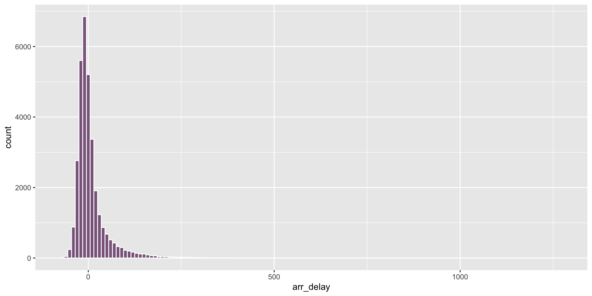
Arrival delays at PDX
How would you describe the distribution?
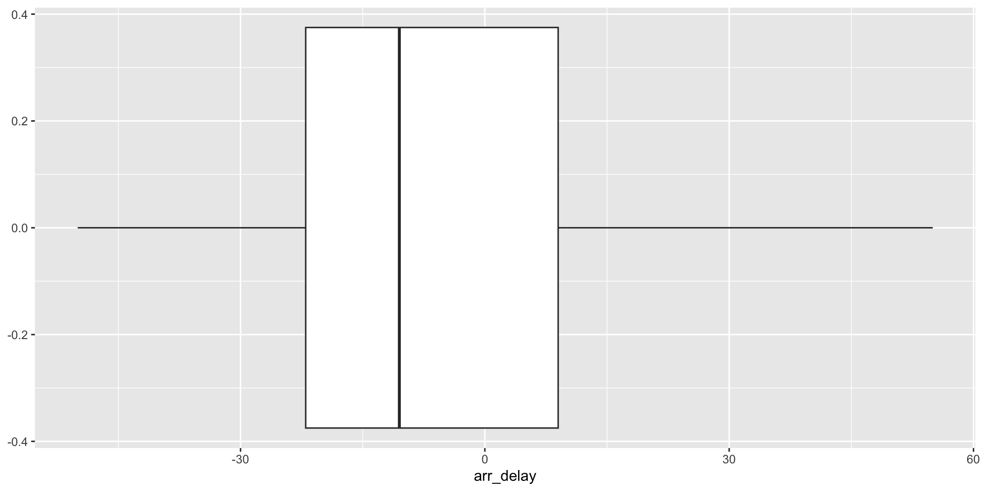
Box plots
Another way to visualize the distribution for arr_delay.

Box plots: median and quartiles
- The box contains the middle 50% of the data points. The median splits the data in half.
- The whiskers depict each of the remaining quartiles.

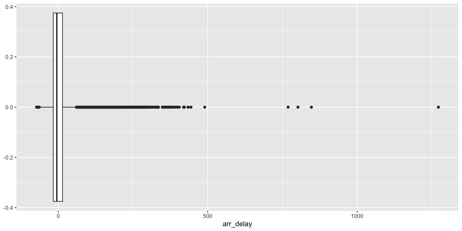
Box plots: interquartile range
- The length of the box is the interquartile range, or IQR
- \(IQR = Q_3 - Q_1\)

Box plots: interquartile range
# A tibble: 1 × 2
  median_ad IQR_ad
      <dbl>  <dbl>
1     -10.5     31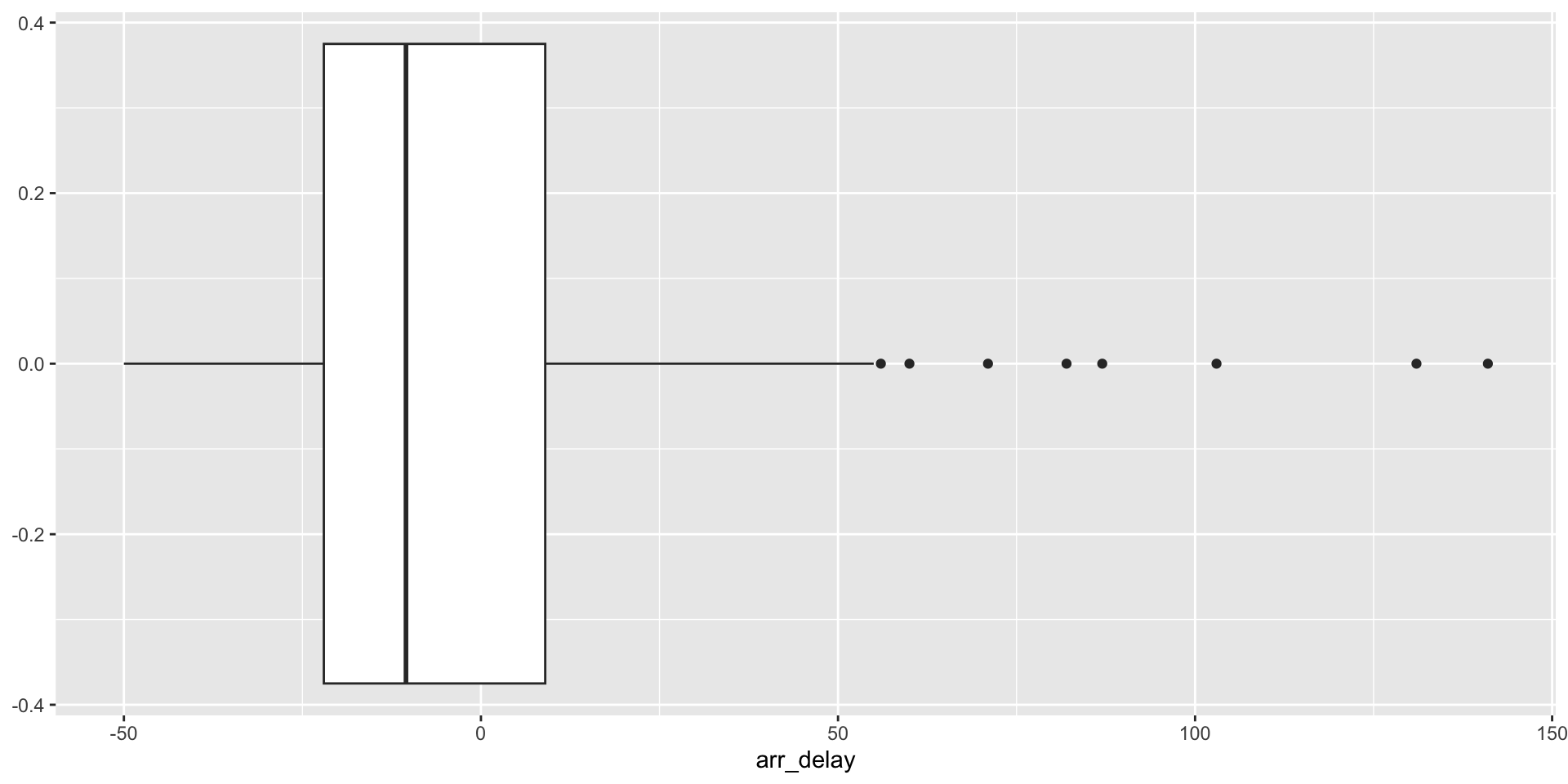
Outliers
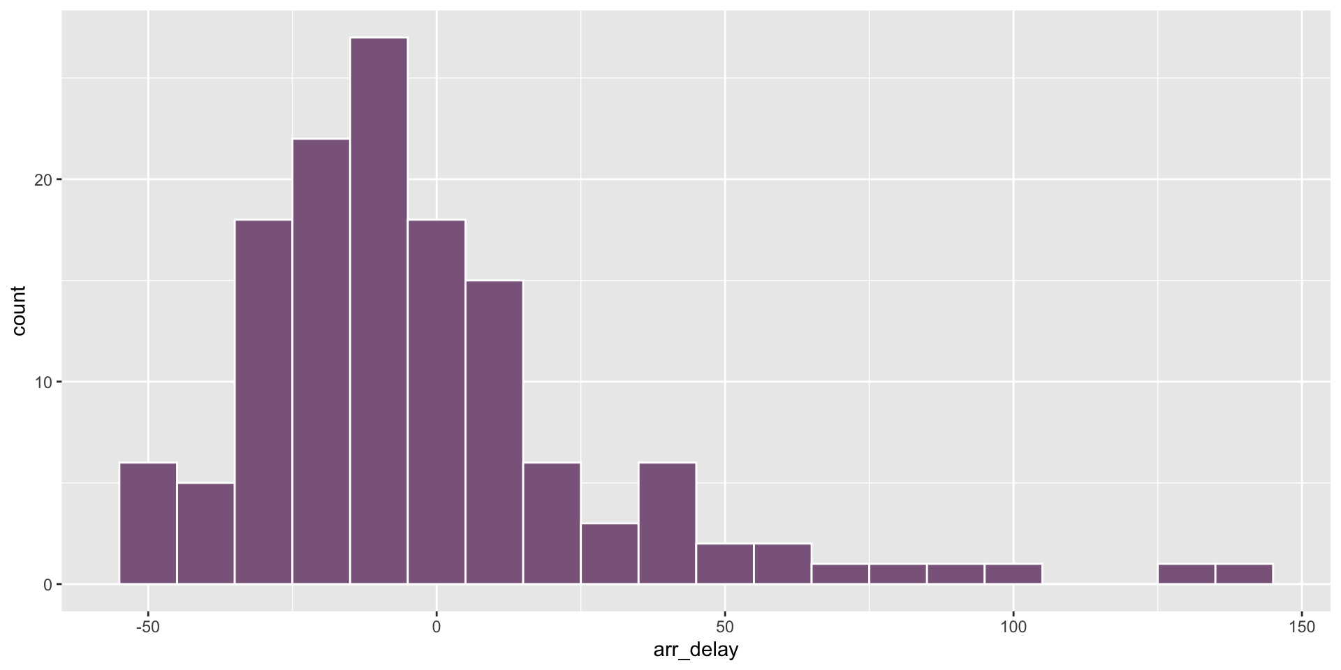
We can remove outliers to inspect the bulk of the data more closely.